

The Beige Awakening
Neutral tones are having a moment in Bangladesh because our homes are quietly shifting toward a more natural, calm, earth-centred aesthetic. It’s part climate adaptation, part cultural rediscovery, and part the global move towards what designers call “earth chic”: spaces that feel airy, textured, and organic without being boring.
You see this shift most clearly in new apartments, renovated older homes, and the work of younger architects who grew up with grey tiles and glossy laminates and want something softer and more grounded. Beige, cream, oat, mushroom, and sand are shades that sit comfortably with our light, our heat, our dust, and our cultural palette. Done right, they create a pleasant, natural backdrop. It lets the interesting things in a room, such as art, plants, wooden textures, and personal objects, actually shine.
Don’t hospitals love beige and minimal?
Nobody wants their home looking like a hospital corridor in the name of “minimalism.” And there’s a fair question: is this the right moment to embrace neutrals, especially with winter on the horizon? Can softer tones feel too dull in the cooler, gloomier months? And what about the impact of Seasonal Affective Disorder (SAD), where muted environments might feel a bit emotionally flat?
Surprisingly, this is exactly the season when neutrals can work best if you build them thoughtfully.
Bangladesh’s climate loves calm colours
Our weather is basically hot, hotter, humid, and “Where did this rain come from?”
Neutral tones reflect heat better than bold, saturated colours. Light beiges and creams help reduce the sense of heaviness in already warm rooms, especially those west-facing Uttara and Bashundhara apartments that trap heat like a microwaved packet of chow mein. Cooler neutrals (mushroom, greige, and pale taupe) create a soothing visual temperature, balancing out the intensity of our tropical climate.
Smaller spaces need softer palettes
With newer apartments hovering around 900–1200 sq ft, the open-plan look is less about aesthetics and more about survival.
Neutrals make tight spaces appear larger, brighter, and less visually chaotic. Bold colours can segment a home too sharply. Neutrals create continuity essential in flats where you can basically stretch your arms and reach three different rooms.
Dust, pollution, and the urban reality
Dhaka dust has a personality. It settles everywhere, it’s persistent, and it laughs at microfibre cloths. The secret? Soft neutrals hide dust far better than dark walls or high-contrast palettes. A beige dining table runner forgives much faster than a navy one. A taupe wall doesn’t broadcast every smudge.
How to use neutrals well (so your home doesn’t look like a clinic)
The danger of beige is… too much beige. So here’s how to keep it stylish, not sterile.
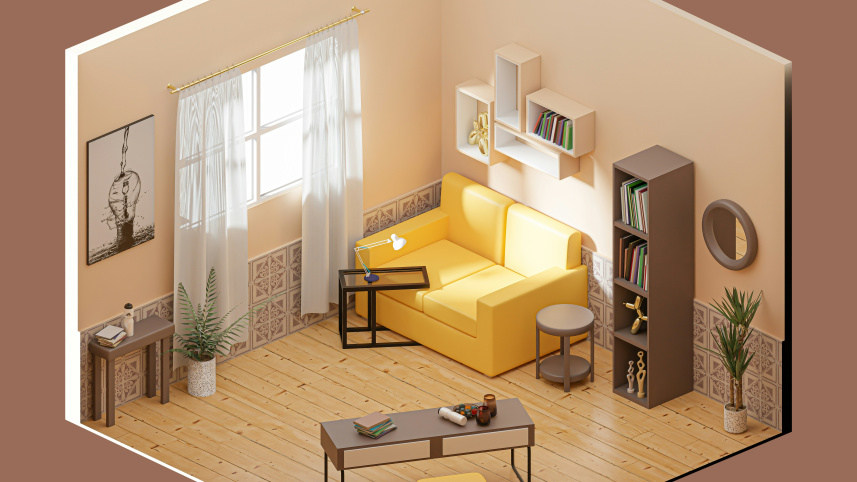
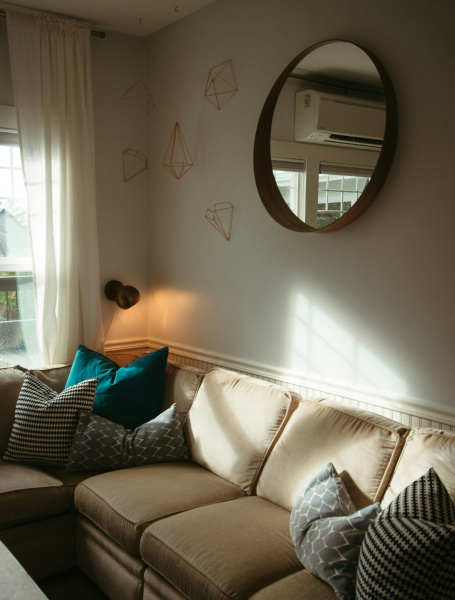
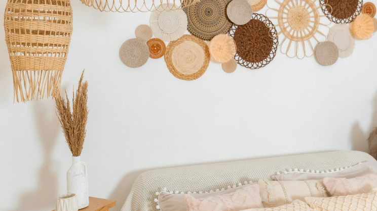
1. Add Texture Like Your Life Depends On It
Neutrals need layers.
Think:
• jute carpets
• linen curtains
• rattan chairs
• cement-texture accent walls
• waffle throws
Texture = warmth.
Flat beige = dental clinic.
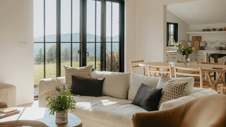
2. Anchor the room with darker elements
A few bold pieces prevent everything from floating into monotony.
Try:
• a charcoal sofa
• dark wooden coffee table
• black metal light fixtures
• walnut shelves
 For all latest news, follow The Daily Star's Google News channel.
 These elements give the room “weight” without killing the neutral theme.
3. Use greenery as colour, not paint
Plants pop dramatically against soft beige walls. Snake plant, monstera, pothos all thrive in our climate and add fresh vibrancy without overpowering the palette.
4. Layer your neutrals
Don’t pick one beige and stick to it.
Mix:
• warm beige
• greige
• soft cream
• oat
• mushroom
• pale sand
This creates depth. Designers call it “tonal variation”; we call it the difference between “warm home” and “clinic corridor.”
5. Metallics Are Your Friends
Brushed brass, matte gold, gunmetal grey: any of these add sophistication.
Just avoid anything shiny enough to double as a mirror for nosy guests.
6. Introduce Art and Personal Pieces
Neutrals are the stage; your personality is the performance.
Add:
• framed prints
• local textiles
• pottery
• black-and-white photography
• travel souvenirs
Even one bold rug can make the entire palette look intentional, not accidental.
A trend worth starting now
Winter is actually the best time to begin this shift. Light is gentler, paint dries beautifully, fabrics behave better, and you immediately feel the benefit of warmth and softness. By summer, the same palette will keep your home brighter, cooler, and calmer.
The Beige Awakening isn’t about playing safe. It’s about choosing a palette that works with our climate, our culture, and our changing lifestyles.
The writer, a former interior designer, still questions the decision to agree to white décor while living with children who touch everything with food-covered hands
Comments