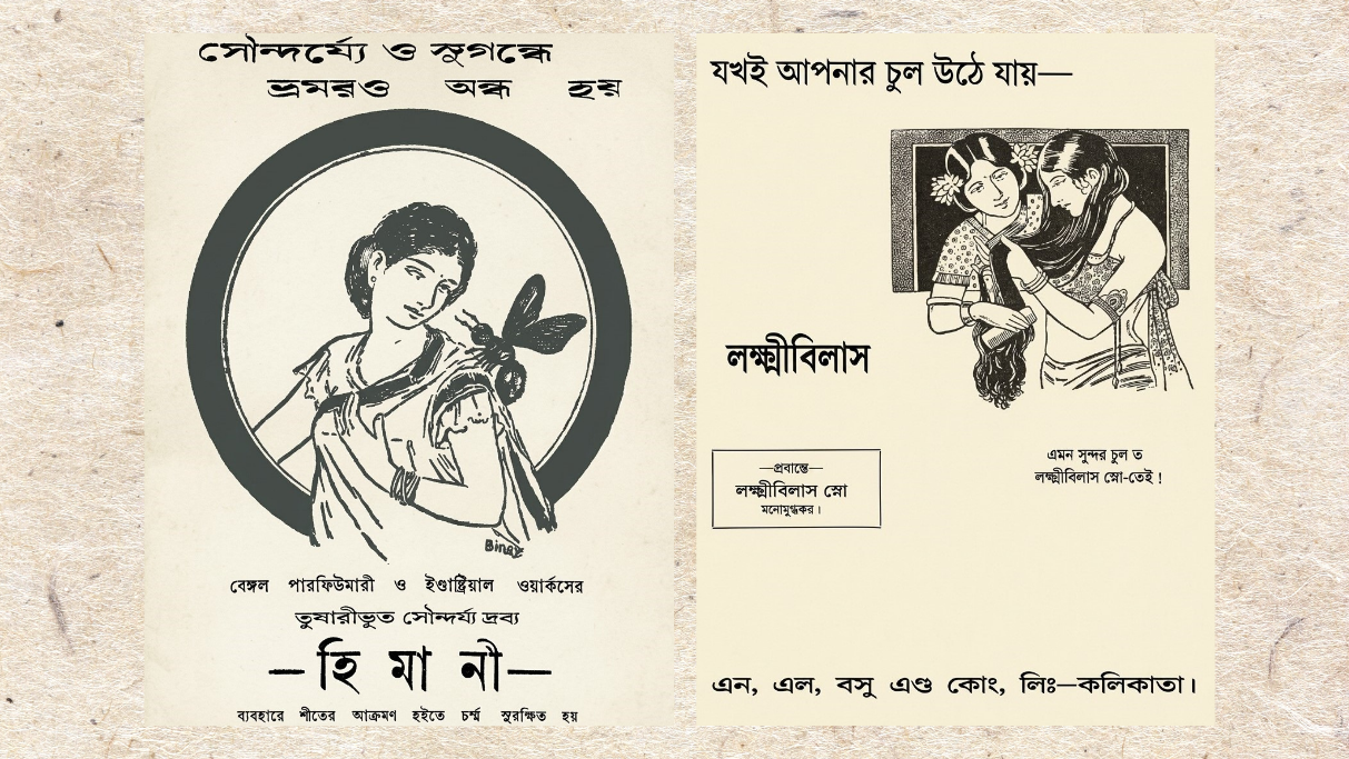
Ghosts, gods, and swadeshi pride
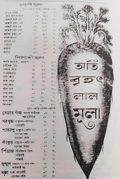
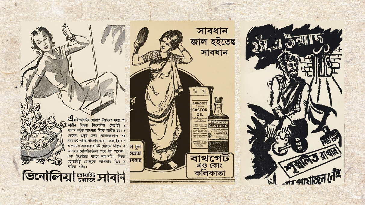
Cartoons were extensively used in advertising at one point, and others followed in Binoy Basu's footsteps. In the case of almanack (Panjika) advertisements, many visuals, though not intended as cartoons, appear highly amusing to modern audiences. An advertisement in an almanack printed on the old printing presses of Battala, featuring a massive radish, is a source of laughter today. The artist Shailo Chakraborty once observed that advertisers often hesitated to promote their products through cartoons. Shailo Babu used to write a regular column on cartoons in the weekly magazine Deepali, edited by Basanta Kumar Chattopadhyay. Later, at the editor's behest, these columns were compiled into a book.
In one of his essays, he remarked that a lack of talented 'commercial cartoonists' may have made advertisers reluctant to adopt this medium. Shailo Babu's compiled essays on cartoons were first published as a book in 1946, though he had penned them before the outbreak of the Second World War. Echoing Shailo Babu's sentiments, one is reminded of another advertising cartoon for a hair oil brand, which was admittedly crude in its execution. The owner of that hair oil company clearly could not find a cartoonist of decent calibre. Located at 151 Mechhuabazar Street, Kishori Lal Chowdhury was the proprietor of the company, and his hair oil was named 'Bhootnath Taila'.
I came across it repeatedly in Bengali newspapers published in 1922. This drawing clearly tapped into contemporary society's folklore and popular beliefs. The presentation carried a supernatural, eerie tone, leveraging commercial trust through occult intrigue. The most bizarre and striking aspect of this advertisement was its choice of character and its surreal imagination. While hair oil advertisements typically featured beautiful hair or elegant women, this one featured two demonic, ghost-like figures, in keeping with the product's name, 'Bhootnath', which translates to the Lord of Ghosts and, according to Hindu mythology, Lord Shiva is the lord of all supernatural and paranormal forces, including ghosts, spirits, demons, and witches. As the dweller of cremation grounds, Shiva controls and protects them all. It is from this perspective that Shiva is called 'Bhootnath'.
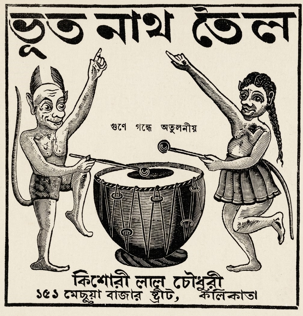
In this advertisement, a male and a female ghost are depicted standing on either side of a massive traditional drum (dhak), dancing as they play it. They were drawn with tails, bizarre ears, and horns. One could argue that utilising such grotesque characters in a hair oil advertisement represented a remarkably bold concept within the advertising landscape of that era. The drawing bore the distinct imprint of the popular woodcut illustrations characteristic of Kolkata's Battala print culture. It stands out as a highly unique document in the evolutionary history of humour in advertising.
I would also like to mention yet another hair oil advertisement. Regardless of the visual's artistic quality, the novelty of the concept remains undeniable. The image instantly brings to mind the famous anecdote of Ishwar Chandra Vidyasagar walking all the way from Midnapore to Kolkata. It has often been written that the exhausted scholar was occasionally carried on someone's shoulders.
Others might recall Nandalal Bose's masterful illustration accompanying Rabindranath Tagore's verse, depicting a Santhal child perched on his father's shoulders. In this advertising visual, we similarly see a young boy riding on a man's shoulders. The boy is shown pouring oil onto his father's head, while the latter has a towel (gamcha) slung around his neck. The advertising tagline read: "Jabakusum Oil keeps the head cool" ('জবাকুসুম তেল মাথা ঠান্ডা রাখে').
Compared with the refinement we witnessed in later hair oil illustrations, this drawing appears rather rudimentary. Yet the expression of sheer relief on the elderly man's face as the oil trickles down his scalp is vividly captured—so much so that one of his eyes is blissfully closed. Although this advertisement for Jabakusum hair oil features a few English letters at the bottom, I have been unable to determine whether they represent the artist's signature or something else.
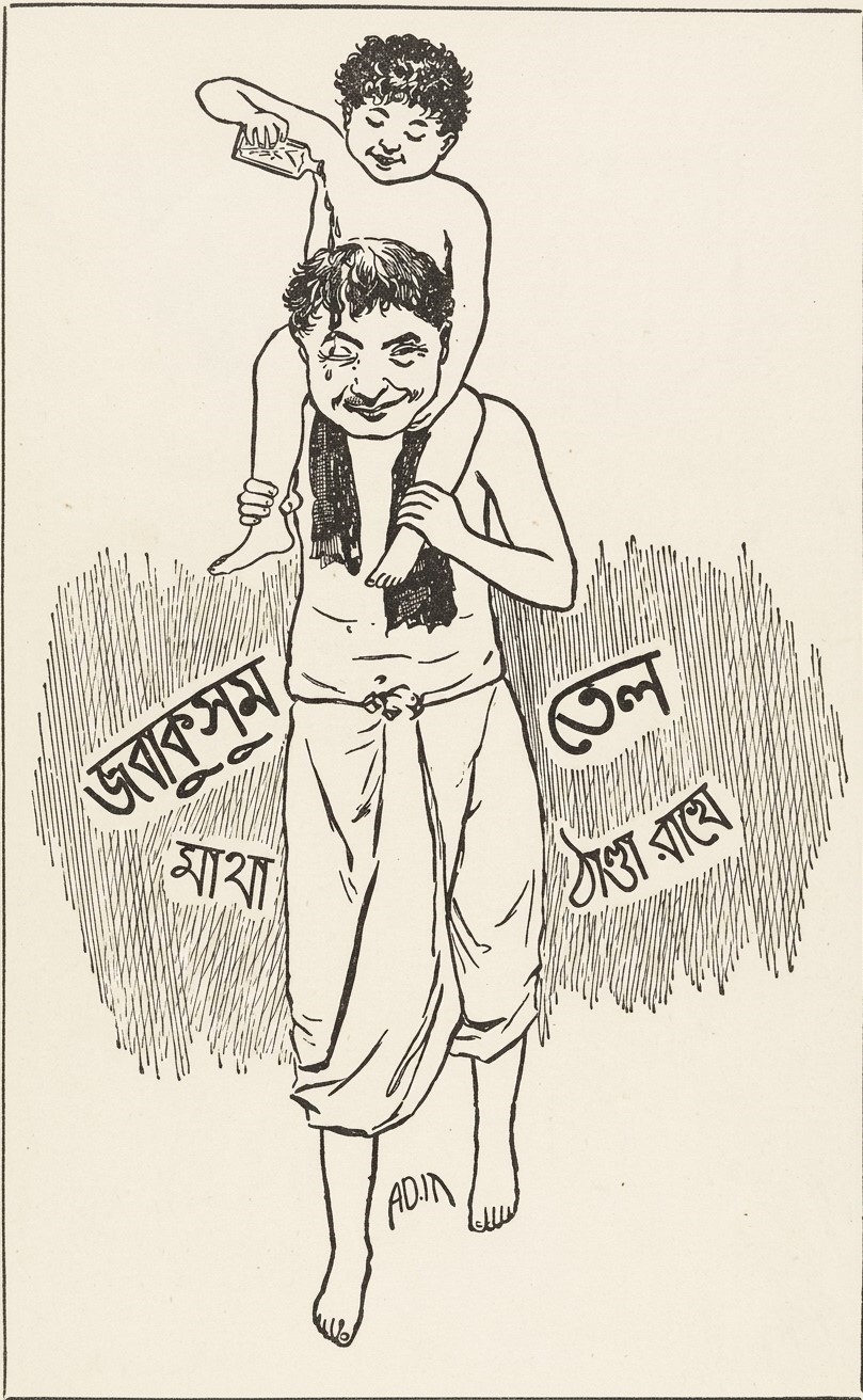
Despite being a sketch, the drawing is clean and devoid of redundant lines. It also showcases a fine specimen of the curved Bengali calligraphy typical of the nineteenth and twentieth centuries. The child pouring oil on his father's head—a gesture of care—beautifully mirrors a familiar, tender scene of traditional Bengali familial affection. Manufactured by C.K. Sen & Co., 'Jabakusum' was one of the most successful indigenous products of the Swadeshi movement era. The visual, too, is entirely swadeshi in spirit. The father's simple dhoti, bare torso, the towel on his shoulder, and his barefoot stride effortlessly evoke the timeless, familiar image of rural Bengal—a man walking down to the village pond for a bath.
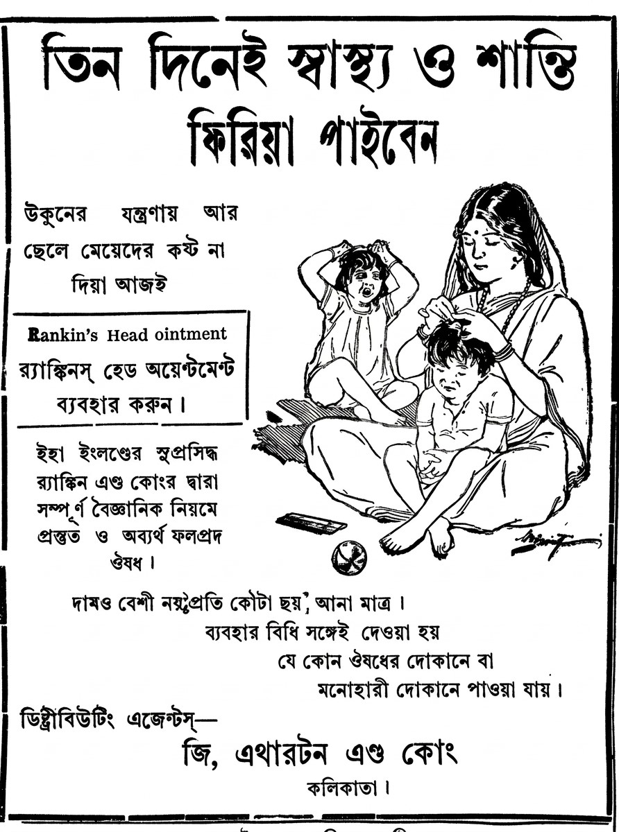
Another such indigenous and realistic advertisement illustration deserves mention here. It is an advertisement for a lice-killing medicine, “Rankin's Head Ointment” (1929), featuring a mother and her two children. If one observes the advertisement closely, a foreign connection is evident right in its name, where it is clearly stated: 'Prepared by the renowned Rankin & Co. of England.' However, it was not just the medicine that was foreign; its style of presentation was also closely modelled on the early twentieth-century Western 'Health & Hygiene' advertisements for family soaps and medicines. I intend to discuss this foreign influence on the advertising trends of undivided India at a later time. Generally, just as Western advertisements appealed to consumers' psychology by depicting the domestic relationship between a mother and her child, this advertisement employed the same European advertising formula to recreate a thoroughly quintessential (আটপৌরে) Bengali household environment. The illustration shows a mother deeply engrossed in picking lice from or applying medicine to one of her children's heads, while another child, sitting nearby, scratches its head in agony. In rural or suburban Bengali middle- or lower-middle-class families of that era, this scene was deeply familiar and formed part of everyday life.
Instead of creating a fictional or fairytale world, this advertisement precisely captured a real, everyday problem faced by ordinary people, allowing consumers to instantly relate it to their own lives. From an illustrative perspective, the meticulous craftsmanship is truly commendable. The mother's posture, the simple, casual drape of her saree, the teep (টিপ) on her forehead, and the agonised expressions on the faces of the two children—everything brilliantly conveys social realism. In particular, the mat spread on the floor, a comb, and that timeless family portrait of distress caused by lice have been brought vividly to life by the artist. To our misfortune, we can hardly ascertain the identity of any of the artists behind these advertisement illustrations.
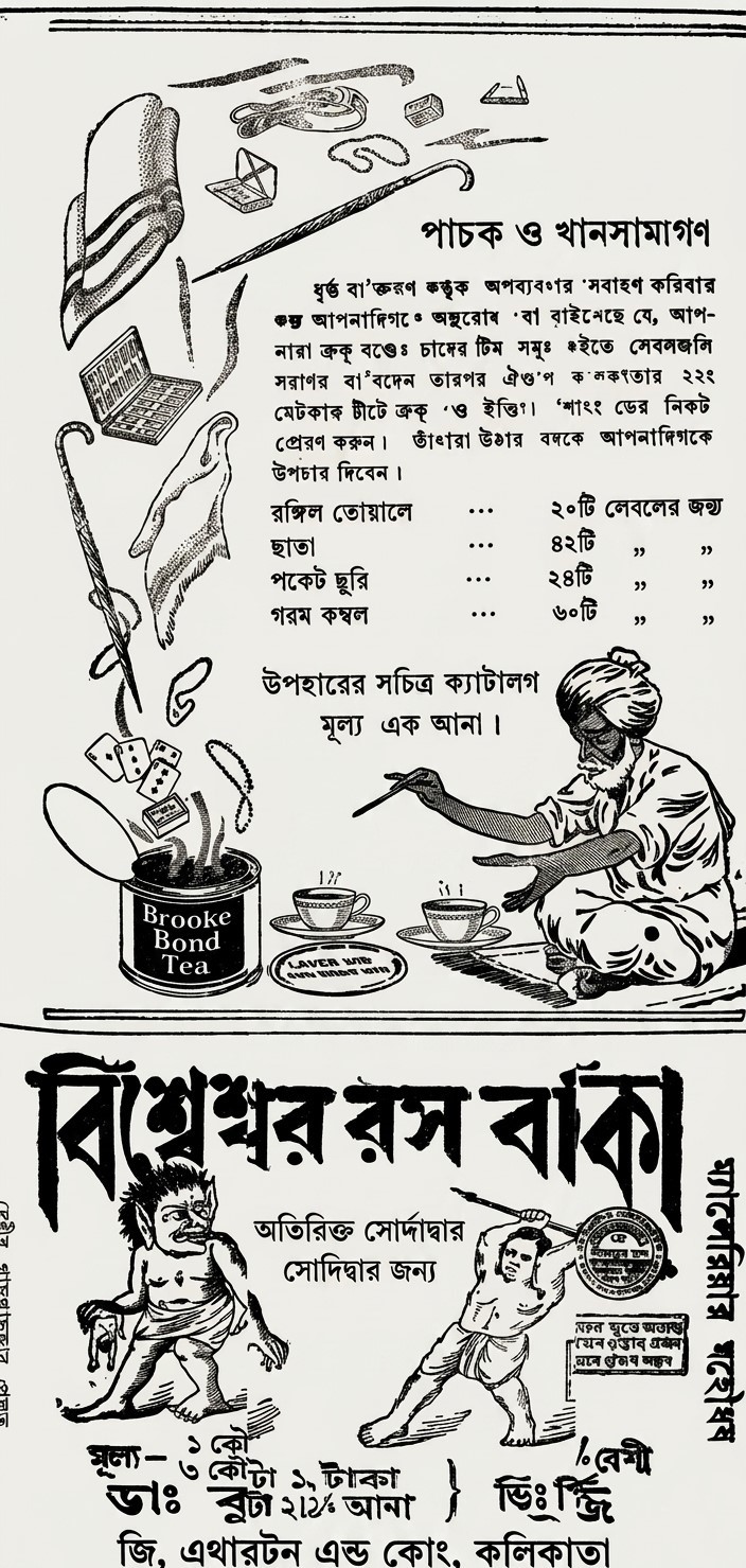
Broadly speaking, the artistic evolution of Bengali advertising began to manifest itself significantly from the 1930s onwards, primarily driven by the creative endeavours of artists attached to advertising agencies. If one examines a particular issue of a Bengali daily from 1929, in which advertisements for 'Brooke Bond Tea' and 'Bisweshwar Rasa Batika' were published side by side in a vertical arrangement, the contrast becomes crystal clear. The tea illustration clearly bears the touch of a skilled, professional artist. The drawings of the steaming tea tin, along with promotional gifts such as towels, umbrellas, pocket-knives, blankets, and playing cards, display a flawless sense of proportion and geometric balance. The depiction of the turbaned butler (khansama) seated at the bottom is particularly striking. His anatomy, the posture of his hands and fingers, his beard, and his seated pose reveal the artist's deep proficiency in anatomy and the interplay of light and shadow. The precise, fluent line work lends the advertisement an international standard and an aura of sophistication.
In stark contrast, the advertisement positioned directly below it for 'Bisweshwar Rasa Batika' (a sovereign remedy for malaria) features a drawing that anyone can identify as crude, amateurish, and melodramatic. The anatomy of the demon causing malaria and the man attacking it with a spear lacks proper proportion, muscular definition, and facial expressions that conform to any recognised artistic grammar. The demon's form resembles a primitive woodcut or a rustic wall painting rather than a professional academic illustration and is completely devoid of modern depth or nuance.
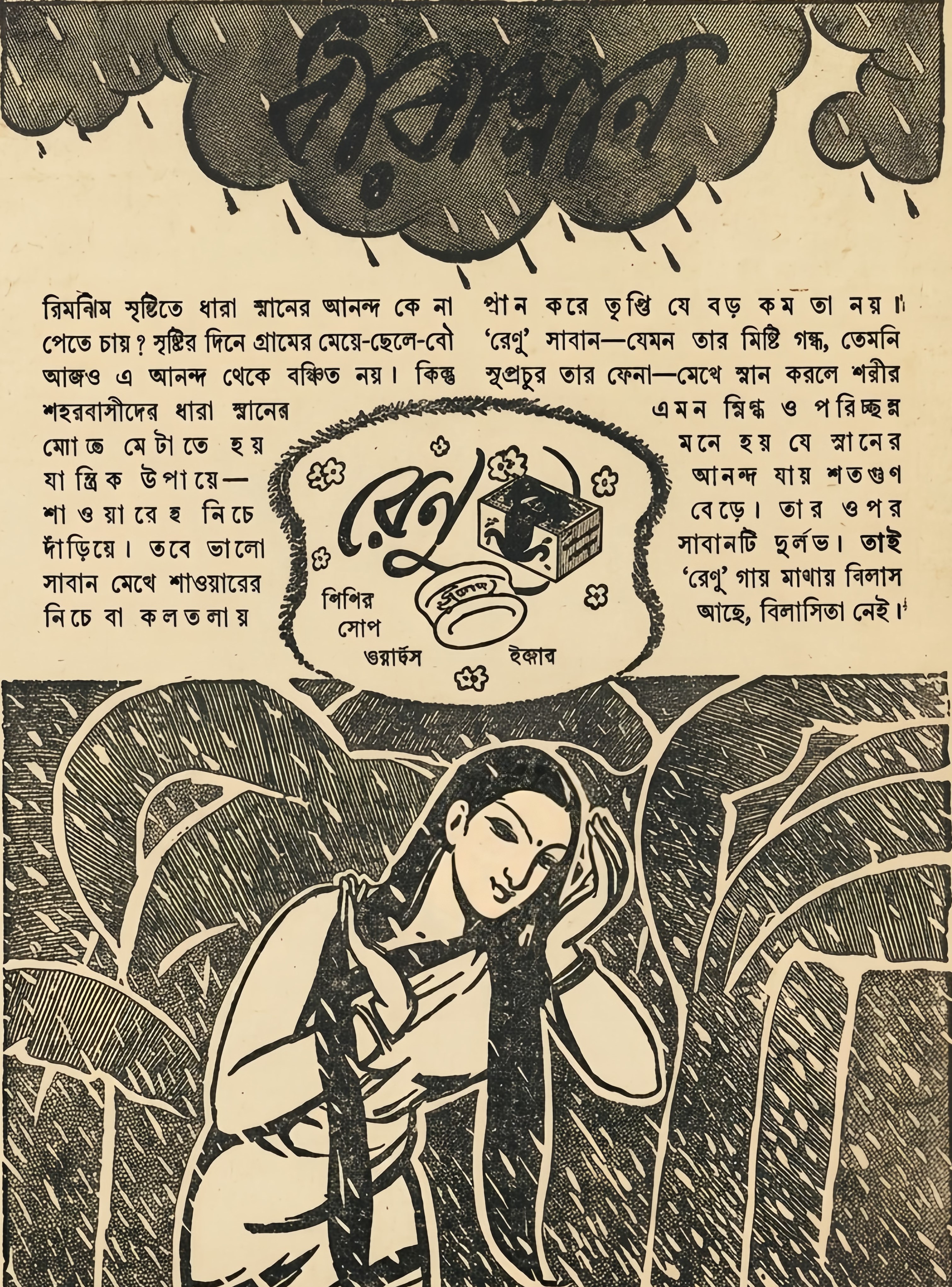
Returning to the Jabakusum advertisement, it features a father carrying his son on his shoulders on the way to a bath. A deeper reflection reveals that bathing serves as an integral motif in the advertisement's message. A series of remarkable advertising visuals centred on the theme of bathing was encountered by Bengalis in the promotions for Renu Soap, manufactured by the 'Hindustan Mercantile Corporation'. In one such advertisement, the copy states that while rural folk enjoy the pure bliss of bathing directly in the pitter-patter of monsoon rain, urban dwellers in brick-and-mortar cities such as Kolkata attempt to recreate that experience mechanically under a shower or at a community tap. It is here that the rich lather and sweet fragrance of 'Renu' soap transform that mechanical bath into a moment of supreme satisfaction. The final line of the advertisement read: "Renu on the skin brings elegance, not extravagance!" (‘রেণু গায় মাখায় বিলাস আছে, বিলাসিতা নেই!’).
From an aesthetic standpoint, the upper portion of the visual, with its linear depiction of clouds and rain, combined with the lower portion featuring a rain-drenched Bengali woman running her fingers through her hair against a backdrop of banana leaves—reminiscent of linocut or woodcut blocks—strongly evokes the style of Abanindranath and Nandalal Bose's 'Bengal School of Art'.
Since the inception of Bengali advertising, unexpected themes have occasionally been introduced to entice consumers. The Bhootnath Taila, Renu Soap, and Jabakusum advertisements mentioned above are merely a few examples. Copywriters and artists always had to remember that without an element of surprise, an advertisement would fail to arrest public attention.
I shall now conclude with an extraordinarily innovative concept that appeared in an advertisement in 1923. It was not merely the promotion of a cold cream, but a profound historical document reflecting the self-preservation of indigenous enterprises, intense nationalist fervour, and the brilliant application of mythological allegory in colonial Bengal during the early twentieth century.
This advertisement for 'Himani' cream, manufactured by the renowned 'Sharma Banerjee & Co.', brilliantly projected the political and commercial battleground of undivided India through the mythological lens of the Chakravyuh (wheel formation) and the slaying of Abhimanyu from the Mahabharata. The illustration depicted the valiant, unarmed Abhimanyu encircled by the seven charioteers (Saptarathi), symbolising how the authentic swadeshi product 'Himani' was surrounded in the marketplace by countless counterfeit and foreign goods. The advertisement issued a powerful warning to the countrymen, urging them not to lose faith in indigenous products by falling prey to cheap imitations.
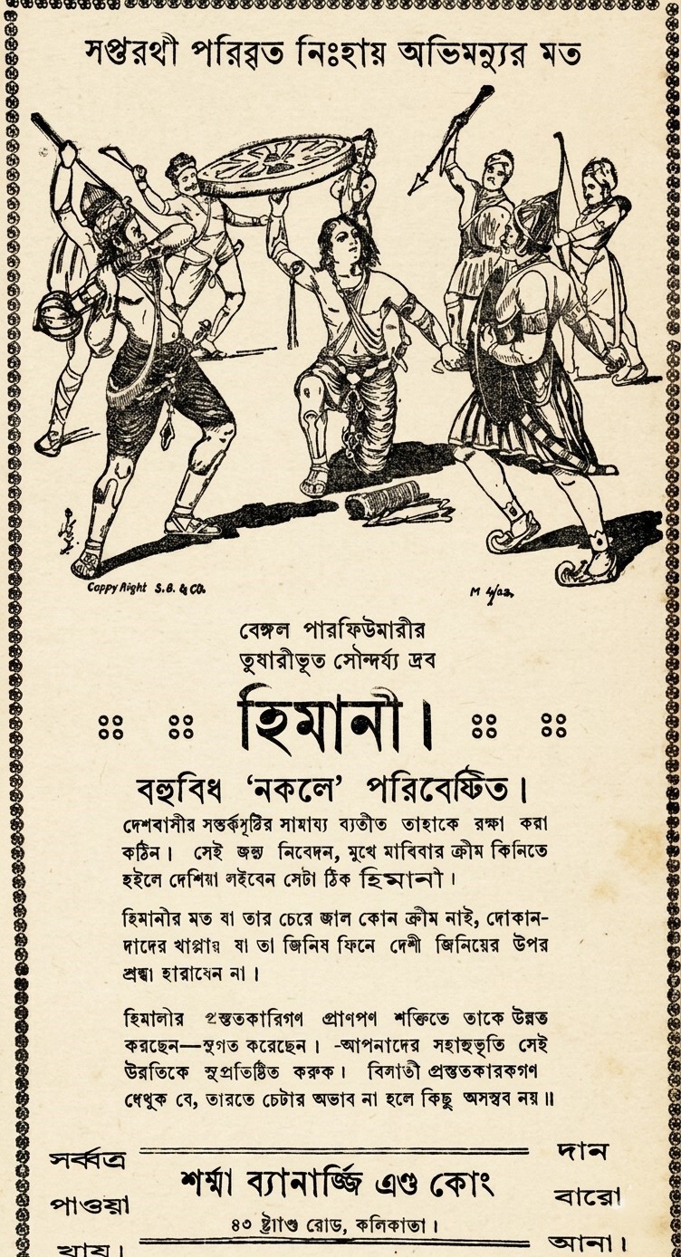
Simultaneously, it threw down a direct challenge to British manufacturers, stating: "Let the British manufacturers see that nothing is impossible in India when there is no dearth of effort" (“বিলাতী প্রস্তুতকারকগণ দেখুক যে, ভারতে চেষ্টার অভাব না হলে কিছুই অসম্ভব নয়।”). This line transcended mere commerce; it was a direct act of economic resistance against British colonial hegemony—a manifestation of the Swadeshi movement. Artistically, this 1923 illustration aligned with the classical academic style of the era. Abhimanyu's posture as he lifts the chariot wheel to fight, the anatomy of the warriors, the intricate detailing of their armour, and the fine line work represent a spectacular specimen of contemporary lithography and woodblock printing.
The address '43 Strand Road, Calcutta', printed at the bottom, bears witness to the commercial history of old Kolkata, while the price tag of 'Twelve Annas' offers a glimpse into the economic realities of that era. Collectively, by taking refuge in a grand mythological allegory to depict a swadeshi brand's battle against counterfeit and foreign goods, this visual transformed a commercial advertisement into an immortal work of political and commercial art.
Sandip Dasgupta has spent nearly three decades working in the editorial offices of newspapers and news portals. He has authored several history-based books, and a subject particularly close to his heart is the illustrations created by Bengali artists.
Send your articles for Slow Reads to slowreads@thedailystar.net. Check out our submission guidelines for details.

Love, faith and family: Inside World Cup players’ tattoos

Can migration help win a World Cup?
A crime history of Bengal: When rivers became a haven for dacoits
Mohajir manuscripts: Field notes from Dhaka Aliya Madrasa

What has changed since the USA ’94 World Cup? Almost everything
Historic Six-Point Movement: The photographs they suppressed

The Tofail Bhai I knew

Mustafa Zaman Abbasi: The man who heard music in the wind
K.A.M. Saaduddin: Architect and activist of anti-imperialist sociology and social movements in Bangladesh